
Since the onset of the COVID-19 pandemic, deaths attributed to many other health conditions have spiked in the U.S.: Alzheimer’s, heart disease, cancer and diabetes, for example, have killed far more Americans than would be expected in a pre-pandemic year.
This “excess mortality” data from the Centers for Disease Control (CDC) underpins a new dashboard created by Rice humanities computing researcher John Mulligan that sheds light on this troubling trend.
“COVID numbers are not the end of the story,” Mulligan said.
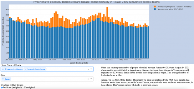
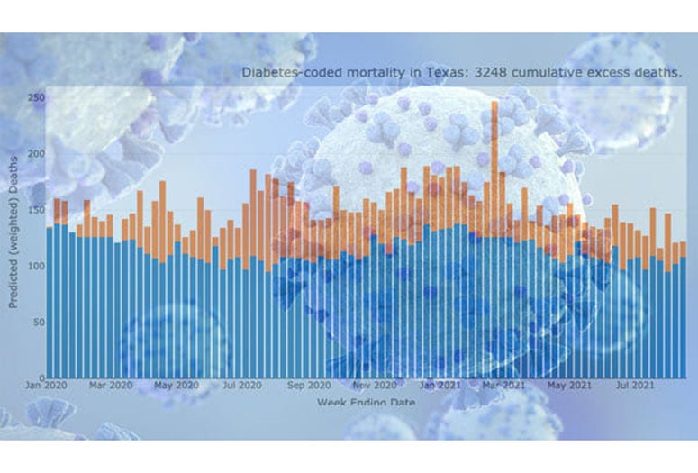
In Texas, for example, when you tally the number of people who died of heart disease or hypertension between December 2019 and August 2021, you would expect to see about 53,000 total deaths, based on the average from previous years’ CDC data. Instead, 60,264 Texans died of these afflictions during this time, about 7,500 more than would have been expected in a non-pandemic year.
Since last year, the Journal of the American Medical Association and other publications have warned that official counts are underestimating the number of deaths associated with the pandemic. Ongoing studies indicate the number of people who would not have died in any other year has been undercounted by 20% to 36%.
“This is not a normal year,” Mulligan said. “You get rid of COVID deaths, and we are still well above the average.”
These excess deaths represent a large, looming and mostly unaddressed public health crisis, especially as recent spikes in rates of positive cases show the pandemic is simply not over. Mulligan’s dashboard, developed in partnership between Rice’s Center for Research Computing and the Medical Futures Lab, shows this ongoing crisis unfolding in stark detail.
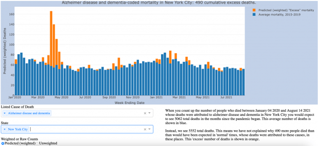
Take, for instance, the well-documented surge in Alzheimer’s deaths in the early months of the pandemic, “pointing to how the coronavirus pandemic has exacted a higher fatality toll than official numbers have shown,” the Washington Post reported.
For example, a nursing home patient with Alzheimer’s might recover from COVID-19, but lose the sense of taste or smell. Soon, that patient might stop eating. A couple of weeks later, that patient might die.
“Was that COVID?” Mulligan asks. “Do you want to add that to the number of COVID deaths your nursing home has on the books? That sort of thing starts to shade into the more unsavory implications of the undercount.”

Also implicated in this widespread undercount are rampant problems within the American health care system and public health programs. As emergency rooms become overcrowded, as beds fill up and as hospital systems strain under the pressure of COVID-19 outbreaks, more and more Americans put off seeking treatment for other medical conditions — or are unable to see a doctor — until it’s too late.
Last month, just outside of Houston, U.S. Army veteran Daniel Wilkinson died due to gallstone pancreatitis, a treatable illness, because there were no ICU beds available. As CBS News reported, Wilkinson lived three houses down from an emergency room and 60 miles from the Texas Medical Center, the largest hospital campus in the world.
Was his death attributable to COVID-19?
And as outbreaks continue to cripple the nation’s health care system, Mulligan said the CDC excess mortality data exposes “a slow-burning background crisis” that’s “absolutely the effect of underinvesting in public health.”
Because the U.S. hasn't provided its health care system “the sort of heavy-duty investing in infrastructure that you would need to buffer against the next hit,” Mulligan said, this excess mortality crisis isn’t going anywhere, and will likely worsen.
“How do you deal with that?” Mulligan said. “There’s no shot for that.”
Since the onset of the pandemic, the “inconvenient data” showing this growing gap in unexplained excess mortality “has been sort of this sleeper, that I think points towards the very long-term effects that we're going to be seeing here,” Mulligan said.
Mulligan said there are more rigorous ways of estimating excess mortality using the CDC’s data. But he developed this visualization to be easily accessible and because state-by-state and regional trends can be unpacked with the dashboard, which also shows data on deaths in 12 different categories (such as sepsis and renal failure).
“We are going to be working to understand the full impact of COVID for a long time, because it has touched so many parts of our lives in ways that are not visible based on just the narrow counts of infections and deaths that are directly attributed to COVID,” said Kirsten Ostherr, the Gladys Louise Professor of English and chair of the Department of English, who is also director of Rice’s Medical Futures Lab.
“Who has not been touched by COVID in some way and how do you even capture that?” Ostherr said. “This excess mortality visualization tool points our thinking to ask those kinds of questions.”
Among the other questions Mulligan aims to address with his data visualization: What counts as “excess” mortality in a post-COVID-19 world? How do public health reporting mechanisms feed into public health? What, and who, “counts” according to our current frameworks, and is this acceptable?
“From a humanistic perspective, the visualization uses data to not answer a question, but to raise a lot of questions that have some wide-reaching implications and that are not easy to answer,” Mulligan said. “Other researchers have made very interesting uses of this data with much more sophisticated models, such as the Weinberger Lab’s early study on excess COVID deaths, and the Preston and Vierboom study out of Penn that turned excess mortality stats on their heads to ask, what counts as normal when we call these deaths excessive?”
“I approached the dataset from a humanistic perspective, attempting to put design-oriented critiques of interactivity to work on a dataset with immediate real-world import. Where interactive data visualizations tend to give the user a sense of certainty and control over unruly datasets, I wanted, with this dashboard, to allow people to drill down into some of the unanswered and underexplored dimensions of the pandemic.”
Life expectancy in the U.S. fell by 1.5 years in 2020, the largest drop since World War II. Those numbers include COVID-19 deaths, of course, but also such “deaths of despair” as suicides and overdoses, which accumulate in step with the isolating effects of the pandemic and the grief and financial strain borne by survivors. Even for those who recover from the virus, the effects of “long COVID” for people with comorbidities like diabetes or high blood pressure can shave more years off their lives.
“How much did their life span go down?” Mulligan said. “We won't know for a while, but that excess mortality is not going away. That gap shows a few things. It shows that we're not addressing the problem. It shows that we're ignoring the problem.”
While many news outlets initially reported on this excess mortality gap, attention has since been diverted back to the spikes in COVID-19 infection and mortality rates. Mulligan hopes his data visualization will help draw attention back to the gap.
“We'll have a lot more people dying in the years to come unless we start taking public health seriously, and well beyond the scope of what we are calling COVID,” Mulligan said.
The COVID-19 Excess Mortality Data Visualization is updated weekly and can be viewed at www.covid-excess-mortality.net.