By Chuck Pool
Rice Athletics has taken on a fresh and dynamic branding identity with a new set of graphic elements, which were released to the public April 11.
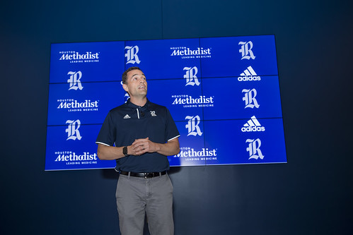
 The results of two years of research and planning were unveiled at a press event as well as during a live webcast from the Brian Patterson Sports Performance Center at Rice Stadium.
“Our goal with the brand refresh was to create a consistent aesthetic that best represents Rice,” said Joe Karlgaard, director of Rice Athletics. “We saw an opportunity to create something clear and visually memorable that would complement our primary mark, the Old English R.”
The new family of design elements was designed to establish the best representation of an authentic Rice Athletics brand, he said. The elements retain the iconic Old English R, which has been the primary mark for the Owls since the 2007-08 season, while incorporating a new wordmark, owl body, owl head, fonts and numerals to be consistent and solidify what the brand represents. The aim is to reinforce and amplify the brand for Rice Athletics for years to come, Karlgaard said.
Rice Athletics’ branding team researched the history of the department’s marks, conducted over 50 interviews with various constituencies (alumni, donors, fans and university personnel, including Public Affairs, coaches, student-athletes and students) and sent a survey to over 25,000 people — those currently engaged with Rice and local Houstonians who are not engaged with Rice.
The feedback received through this process revealed:
- Strong affinity for the Old English R but a lack of broad recognition.
- Mixed feelings for the Old English Script with a sense it is disconnected from the direction of Rice Athletics.
- Fondness toward being an Owl and all that it represents but a desire for an owl mark that is dynamic, sharp, aggressive and relevant.
- A need for marks that are legible, usable, recognizable and consistent.
Rice University Athletics partnered with Torch Creative and Adidas to create an identity that addressed the key points from the feedback to create visual assets aligned closely with the department’s vision and to further reinforce a commitment to athletic excellence.
The press event was the kickoff to a series of events to promote the introduction of the new graphic identity. Fans who attended the second game of the Silver Glove baseball series with Houston the evening of April 11 received rally towels with the new marks and Rice students sitting on the hill in left field got free T-shirts.
For more information, visit the new Rice Athletics’ brand style guide or visit the department’s brand website.

